//
Branding
24 Sep 2026
6 min
READ
BY
Prisma Studio
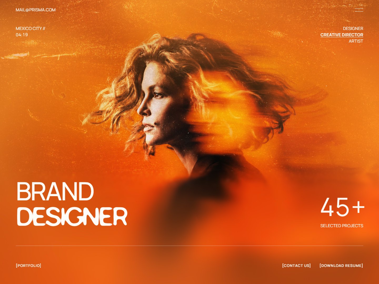
Perceived value is decided in the first three seconds. Long before anyone reads your pricing, the type, spacing and restraint on the page have already told them what to expect — and what you're likely to charge.

[ the first screen of the novara identity, 2025 ]
Most founders think of their brand as a logo and a colour. Visitors experience it as a feeling of how established you are — formed before they've read a single sentence. That feeling is what lets one studio charge three times another for work that looks similar on paper.
01 — The first three seconds
In the opening moments a page is scanned, not read. People register scale, contrast and how much empty space there is. Dense, busy layouts read as cheap and urgent. Generous margins and a clear hierarchy read as calm and expensive, whether or not either is true.
This is why the hero matters more than any section beneath it. One confident headline, one action, and room around both does more for perceived value than a carousel of every service you offer.
“Restraint is the most expensive thing you can put on a page — because it only works when everything else is right.”
— PRISMA STUDIO
02 — Restraint reads as confidence
Premium brands say less. They use fewer typefaces, fewer colours and fewer calls to action, and they leave the decisions that remain looking deliberate. In practice that means:
One typeface family, two at most, with a strict type scale
A single accent colour reserved for the action that matters
Spacing on a fixed scale, so every gap looks intentional
Photography with one consistent treatment, not a mix of stock styles


03 — Where it quietly falls apart
The details that undo a premium impression are rarely the big ones. It's a button with slightly different padding on one page, a second shade of grey that crept in, or a testimonial set in a font that doesn't belong. Each is small; together they tell the visitor nobody was paying attention.
A design system exists to stop that drift. When colours, type and spacing are tokens rather than choices, the hundredth page looks as considered as the first — and the brand keeps looking expensive long after launch.
[
Branding, Pricing, Identity
]